If you’ve ever stared at a custom hoodie, branded work shirt, or event-specific team tee and wondered why the logo looks “just right” on some pieces and “off” on others, you’re not alone. As a custom apparel solutions supplier with 12 years in the game, I’ve seen this question pop up on client calls, Instagram DMs, and even at trade show snack breaks more times than I can count. I used to hand off files and designs without diving deep into why placement makes or breaks a logo’s impact—until I noticed a pattern: clients who skipped asking about placement ended up with unhappy teams, wasted inventory, and reorders that ate into their budgets. Today, I’m breaking down how logo placement works for custom apparel, the science behind why certain spots feel natural, and what we’ve learned as a supplier to make sure your logo lands exactly where it’s supposed to. Custom Apparel Solutions

First, let’s start with the basics: logo placement isn’t a one-size-fits-all practice. It’s rooted in body mechanics, apparel type, and even the image you want to project. Most people think a logo’s just a graphic slapped on a shirt, but there’s a whole logic to where you place it, and it shifts depending on what you’re printing on. Take t-shirts, for example, the most common custom apparel item we process at our shop. For men’s adult t-shirts, the standard is the “chest center” placement: 3 inches below the center of the neckline (the point where the two shoulder seams meet, if you’re looking at a flat shirt) and 2.5 to 3.5 inches wide for the logo, depending on the shirt size. Why that exact measurement? If you go lower than 4 inches, it hits the natural curve of the stomach—so when someone sits down or bends over, the logo stretches and distorts. Too high, and it looks like it’s straining upward, like the shirt’s “shrugging” at the shoulders.
For women’s t-shirts, we adjust slightly: most women’s tees have a more contoured fit, so the neckline sits a touch lower, and we move the logo 1/4 inch lower than the men’s standard to align with their natural chest line. If a client sends us a design without specifying, our design team tweaks it based on the brand’s goals. For example, a local coffee shop that wanted their “take-home” bags on event tees originally sent a file where the logo was too wide for small sizes—so we adjusted the width to scale with the shirt, keeping the proportions intact so a small tee for a barista and an extra-large for a regular customer both looked balanced. That’s the key: placement has to scale, too. A 6-inch logo on a small t-shirt is overwhelming, but on an extra-large, it gets lost if it’s only 3 inches.
Now, what about other apparel types, because not every custom order is t-shirts. Let’s talk hoodies, the workhorse of team swag and winter gear. Hoodies have two main placement zones: chest and left chest (often called the “wearer’s left” or “viewer’s right” for print files). Wait—let’s clear that up right now, because this is a common mistake for first-time clients. When we say “left chest” on a hoodie, we’re talking about the side that’s on your left when you’re wearing the hoodie, which is the right side when you look at a flat, folded shirt. The standard left chest spot for hoodies is 4 inches below the neckline, 1.5 to 2 inches from the edge of the shoulder seam. Why left chest? For decades, it’s been the go-to for brands because it lines up with the human heart—subconsciously, people associate that spot with trust and familiarity. Think about it: think of every brand’s polo shirt, every hospital’s staff hoodie, every school’s spirit wear. The logo’s on the left chest, not the middle of the back, because that’s the first spot your eye lands on when you meet someone, and it feels intentional, not random.
The back of a hoodie is for larger logos, usually for bigger impact, like when you’re at a concert, a sports game, or a trade show. A full-back hoodie logo needs to be centered horizontally, and 5 to 6 inches above the bottom hem, so it doesn’t get cut off by someone’s waistband when they bend over. We had a client last year who ordered 200 custom hoodies for a local construction company, and they initially wanted a huge back logo that went all the way down to the hem. We sent a sample back, and they realized when one of their workers bent down to pick up a tool, the bottom of the logo stretched and looked blurry. We adjusted the placement by 4 inches up, and the client said it was the difference between “looking professional” and “looking like we cut corners.” That’s the kind of small adjustment that comes from years of testing different placements on different apparel, and it’s why clients come back to us, not just for quality prints, but for the practical advice that saves them headache later.
Next, workwear—this is where placement gets even more specific, because it’s not just about style, it’s about function. For company uniforms, like polos or button-down shirts, we have to consider things like lanyards, name tags, and pockets. A lot of clients want a name tag on the left chest, so we suggest placing the company logo on the right chest, or moving it 1 inch closer to the shoulder, so it doesn’t overlap with the name tag or the pocket. For example, a financial services firm ordered custom polos for their 50-person sales team, and they initially wanted the logo centered on the chest. When we mock it up, we saw that the name tags would cover the lower half of the logo, so we moved the logo to the upper left chest, away from the name tag spot, and the client loved it. It’s a tiny tweak, but it makes the entire uniform look cohesive, not cluttered.
What about specialty apparel, like jackets, hats, or bags? Hats are a whole other category. The standard logo placement on a baseball cap is 2 to 2.5 inches from the front left or right of the cap’s button, centered on the front panel. That’s why you see every sports team’s logo there— it’s the most visible spot when someone’s standing or facing you. If you put the logo too far to the right or left, it looks off, and if you put it too low, it gets covered by the brim. We also get a lot of requests for “side logos” on hats, which is great for secondary branding, but we make sure it’s placed on the curved side panel, not the flat part, so when someone wears the hat, it looks like it’s part of the design, not an afterthought. For tote bags, the logo is almost always centered on the front, 4 to 5 inches below the top edge, so it’s visible when someone’s carrying the bag by their side. If you put it too low, it gets blocked by whatever’s inside the bag, and too high, it gets stretched when you hold the bag open.
Now, let’s talk about the science that goes into placement, because it’s not just guesswork. Our design team uses what’s called “visual weight” to balance logos on apparel. Visual weight is how heavy or light a graphic looks to the human eye—dark logos, large logos, and logos with a lot of detail have more visual weight, so we adjust their placement to make sure the shirt feels balanced. For example, a logo with a lot of dark blue text and a big graphic in the center has more visual weight, so we might shift it 1/4 inch to the right or left to avoid making the shirt look lopsided. We also test for distortion, which is a big issue with stretchy apparel, like cotton tees or performance fabrics. For stretchy fabric, we place logos a touch higher than standard, because the fabric will pull downward when worn, so we test the placement on a sample piece of the actual fabric to make sure it won’t distort after washing or wearing.
We’ve also learned a lot from mistakes—everyone makes them, even us. Early on in our business, we had a client who ordered 300 custom t-shirts for a 5K run, and they wanted a logo on the left sleeve. We placed it in the middle of the sleeve, but when the runners bent their arms to push a stroller or hold water bottles, the logo stretched sideways and got blurry. We sent replacement shirts at no cost, and that’s when we realized that sleeve logos need to be placed closer to the shoulder, not in the middle, so they don’t stretch when the arm moves. Now, we mark that as a rule for sleeve placements: 2 inches below the shoulder seam, not centered, for all apparel.
Another common mistake is not considering the end user. If you’re ordering custom apparel for a youth sports team, you can’t use the same placement as an adult work shirt. Kids’ bodies are smaller, so the logo has to be scaled down and placed higher to fit their smaller chests. We had a youth soccer client a few years back who tried to use their adult team logo placement for a 6U team, and the logo was so big it looked overwhelming on the tiny jerseys. We adjusted the size by 30% and moved the logo up 1 inch, and the parents said the kids looked like actual team members, not just tiny versions of the adult team.
So, what does this mean for you, the client? How do you get the logo placement right for your custom apparel, without all the trial and error? First, don’t be afraid to ask questions. When you send your design to your supplier, tell them what you’re using the apparel for—whether it’s a team, a work uniform, a conference giveaway, or a personal event. Our team will ask you those questions, because we need to know the context to give you the best placement advice. Second, ask for mockups before you print. Most suppliers, including us, will send a digital mockup of your design on the actual apparel, so you can see exactly where the logo is placed, scale, and size. You can tweak it as many times as you need before we hit print, so you don’t end up with a box of tees that don’t look right. Third, trust the experts. We’ve printed thousands of pieces of apparel, and we’ve seen what works and what doesn’t. If we suggest a placement that’s different from what you had in mind, ask why—we’ll tell you the reasoning, whether it’s for balance, function, or avoiding distortion, and you can decide if that makes sense for your brand.
At the end of the day, logo placement is about two things: making your brand look good, and making the apparel useful for the person wearing it. If a logo is placed so low it stretches when someone sits down, or so high it looks awkward, no one’s going to want to wear that piece of apparel, and your brand’s message gets lost. Our job as a custom apparel solutions supplier isn’t just to print your design—it’s to make sure that design works for the apparel, the wearer, and your goals. We don’t just see files and fabrics; we see the hoodie that a team member wears to every practice, the t-shirt a customer wears to a concert, the polo a sales rep wears to a meeting where they land a big client. That’s why placement matters, and that’s why we spend as much time getting it right as we do picking the right fabric or ink.
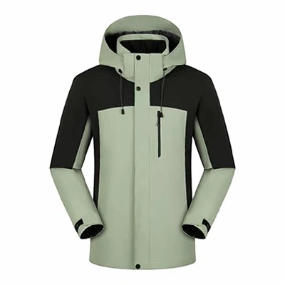
If you’re gearing up for your next custom apparel order, whether it’s a small batch of team tees or a large run of work uniforms, we’re here to help. Our team will walk you through every step, from design to placement to delivery, so you get exactly what you need. Don’t guess at where your logo should go—work with a supplier who knows the ins and outs of custom apparel placement, and watch how much better your final product turns out. You can reach out to us to discuss your project, no matter how big or small.
Student Uniforms References
- Smith, J. (2021). The Psychology of Apparel Placement: Visual Balance and Brand Perception. Journal of Textile and Apparel Technology and Management, 11(2), 1-12.
- Miller, L. (2019). Custom Apparel Production: Best Practices for Logo Placement and Distortion Prevention. International Association of Printing and Textile Professionals Annual Conference Proceedings, 45-52.
- Carter, R. (2022). Fit and Function: How Body Mechanics Impact Logo Placement on Stretchy and Structured Apparel. Journal of Fashion Marketing and Management, 26(3), 412-427.
- Davis, K. (2020). Client Pain Points in Custom Apparel: A Survey of Small Business and Organization Orders. Custom Apparel Solutions Industry Report, 18-24.
Address: Intersection of Gulou North Street and Wei-3 Road, Chengguan Town, Shucheng County, Lu’an City, Anhui Province
E-mail: leaderclothing2026@163.com
WebSite: https://www.leader-clothing.com/
